

JD Size Guide
Finding the real friction behind a sizing problem
Overview
Getting the wrong size isn't a small problem for a retailer. It can mean a return, a refund and a customer who loses confidence before their next purchase.
Sizing had become significant enough to reach JD's CEO, and I was asked to understand where the existing sizing journey was breaking down — and what could be done about it.
Working alongside a User Researcher, I mapped the experience across desktop, mobile and iOS and Android apps, then used research findings to identify two specific points of friction.
The key insight was that this wasn't primarily a visual design problem. The experience was struggling because the information users needed was inconsistent, difficult to find or difficult to interpret.
The resulting size-guide pattern was later incorporated into JD's design system, giving teams a more consistent foundation for future sizing experiences.
The problem
The existing sizing journey varied across brands, devices and product categories.
For a returning shopper trying to choose the right size, this created two particularly important problems:
Finding the right information was difficult.
The size guide was hidden inside an accordion, and not every brand had a guide available. Where information was missing or presented in unfamiliar units, shoppers were left to make their own judgement.
The path to buying another size was awkward.
The add-to-basket journey moved quickly towards checkout, making it difficult to add a second size “just in case”. Confusion around the third-party True Fit tool could also encourage shoppers to order multiple sizes and return what didn't fit.
Both problems had the same underlying consequence:
Users were being asked to make a purchase decision without feeling confident they had the information to make it.
Finding where the journey broke
Rather than starting with the size-guide component itself, I mapped the experience of a returning shopper adding a product to their basket.
I looked across:
Desktop
Mobile web
iOS
Android
Well-known brands
More niche brands
This helped expose inconsistencies that weren't obvious when looking at an individual screen.
Research sessions then confirmed where those inconsistencies became meaningful problems for shoppers.
Two moments stood out:
01 — Finding the right size information.
Users had to actively search for the size guide, and the experience wasn't consistent across brands. When a brand-specific guide wasn't available, shoppers could be left comparing unfamiliar measurements or guessing.
02 — Acting on uncertainty
If a shopper wasn't confident about their size, the journey didn't make it particularly easy to manage that uncertainty. The route towards checkout encouraged a single purchase decision, while True Fit introduced another layer of complexity.
The issue wasn't simply that the size guide looked dated.
Users didn't always have the information or confidence they needed to make the decision to purchase.
Reframing the problem
I facilitated a workshop to turn the research findings into clearer user needs.
One particularly useful need came from returning shoppers:
“I want JD to remember my sizing information and use it to help me choose next time.”
From there, we developed “How might we” questions around:
Making brand-specific sizing information easier to find
Helping users choose confidently when JD didn't hold brand-specific data
Reducing friction around True Fit
Making sizing information easier to understand
Avoiding unnecessary re-entry of information for returning shoppers
This shifted the design challenge from:
“How should we redesign the size-guide UI?”
to:
“What information does someone need to make a confident sizing decision?”
That distinction shaped the solution.
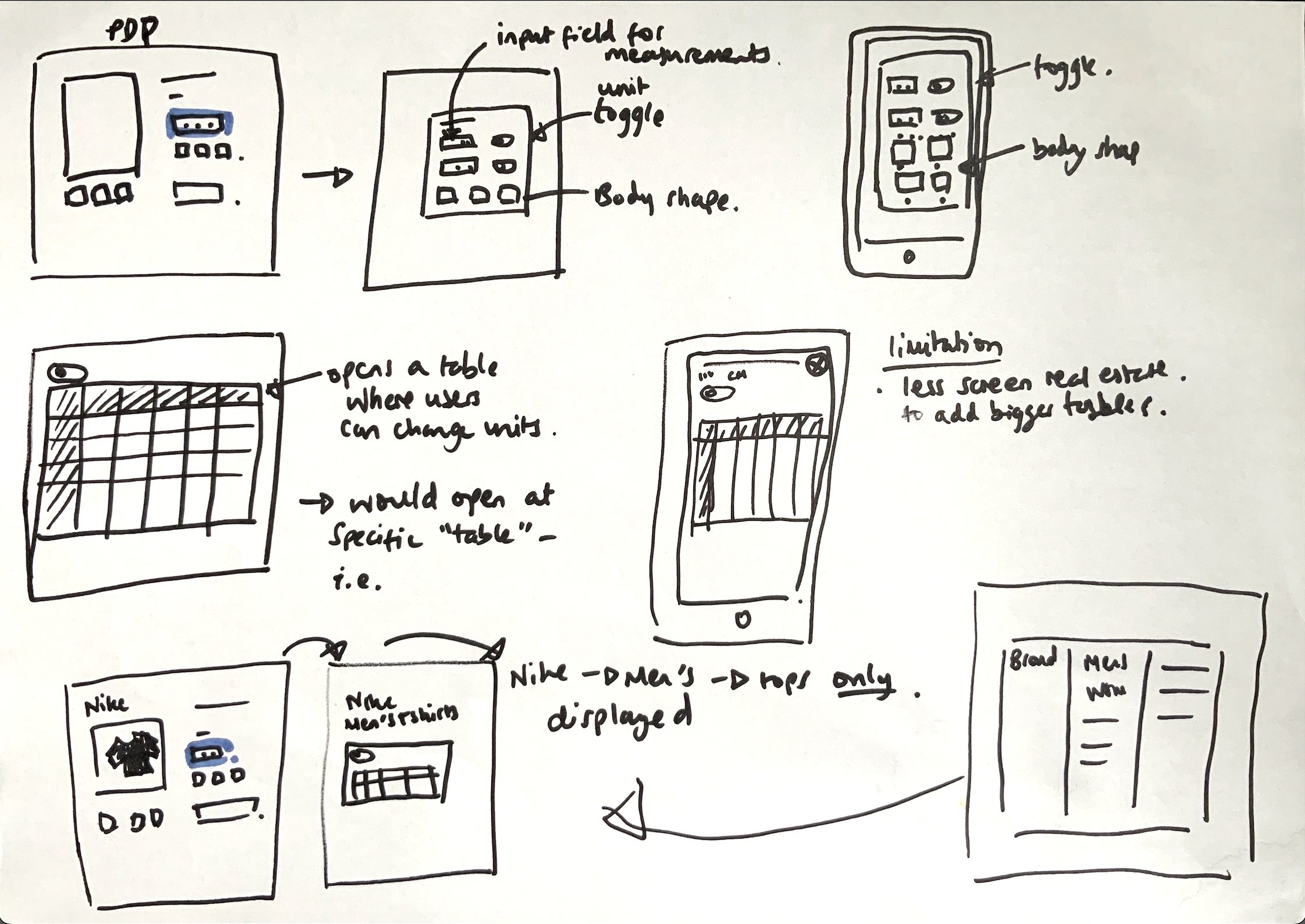
Exploring 3 directions
Size recommendation
Instead of asking shoppers to interpret a measurement table, collect their measurements and recommend a size.
This could reduce the amount of interpretation required from the user, but would introduce a more involved input journey and would require stronger validation.
Unit conversion
Allow shoppers to switch between centimetres and inches within the size table.
This addressed one of the clearest information problems without introducing additional questions or complexity.
Brand-first size guides
Instead of making shoppers search through an accordion, take them directly to the relevant size guide for the brand and category they are viewing.
Where JD didn't have brand-specific information, the experience could fall back to a clearer generic guide.
I explored three concepts to test different ways of solving the problem.
The Key Decision
The strongest direction wasn't about adding the most functionality.
It was about prioritising the information we knew mattered most.
Where JD held brand-specific sizing data, the guide should surface that information directly.
Where it didn't, the fallback should still be understandable including using units the shopper could actually interpret.
That meant solving the most immediate information gap rather than trying to solve every inconsistency in sizing across every brand.
The principle was simple:
Make the right information easier to find before adding more ways to calculate an answer.
Designing The Pattern
I translated the direction into mid-fidelity wireframes and presented them to senior stakeholders in Adobe XD.
The work focused on creating a more consistent pattern that could work across different brands and categories rather than designing a one-off solution for a single product.
The stakeholder response was positive, but technical feasibility and resourcing meant the work required further scoping before it could move into development.
So the project did not launch as a finished feature within the two-week timeframe.
That distinction matters: the concepts were not fully validated, and I wouldn't claim that the proposed unit toggle or recommendation form improved conversion without further research.
What carried forward
Although the feature itself wasn't launched at that point, the underlying size-guide pattern was later incorporated into JD's design system.
That gave other teams a consistent starting point for sizing experiences instead of repeatedly solving the same structural problem from scratch.
For me, this was an important outcome because it meant the work had value beyond the individual screens I designed.
Reflection
This project reinforced something I now actively consider when working to a tight deadline:
Two weeks can be enough to find the right problem. It isn't necessarily enough to prove the complete solution.
There was a temptation to keep expanding the concept — recommendation logic, unit conversion, True Fit improvements and remembered sizing — but not all of those ideas had been validated.
Rather than presenting an impressive-looking but largely untested redesign, I focused on evidencing the underlying problem and creating a scalable direction that could be taken forward.
The most useful shift was from redesigning a component to designing for decision confidence.
That changed what I looked for, what I prioritised and ultimately what became useful beyond the project itself.