

Pretty Polly
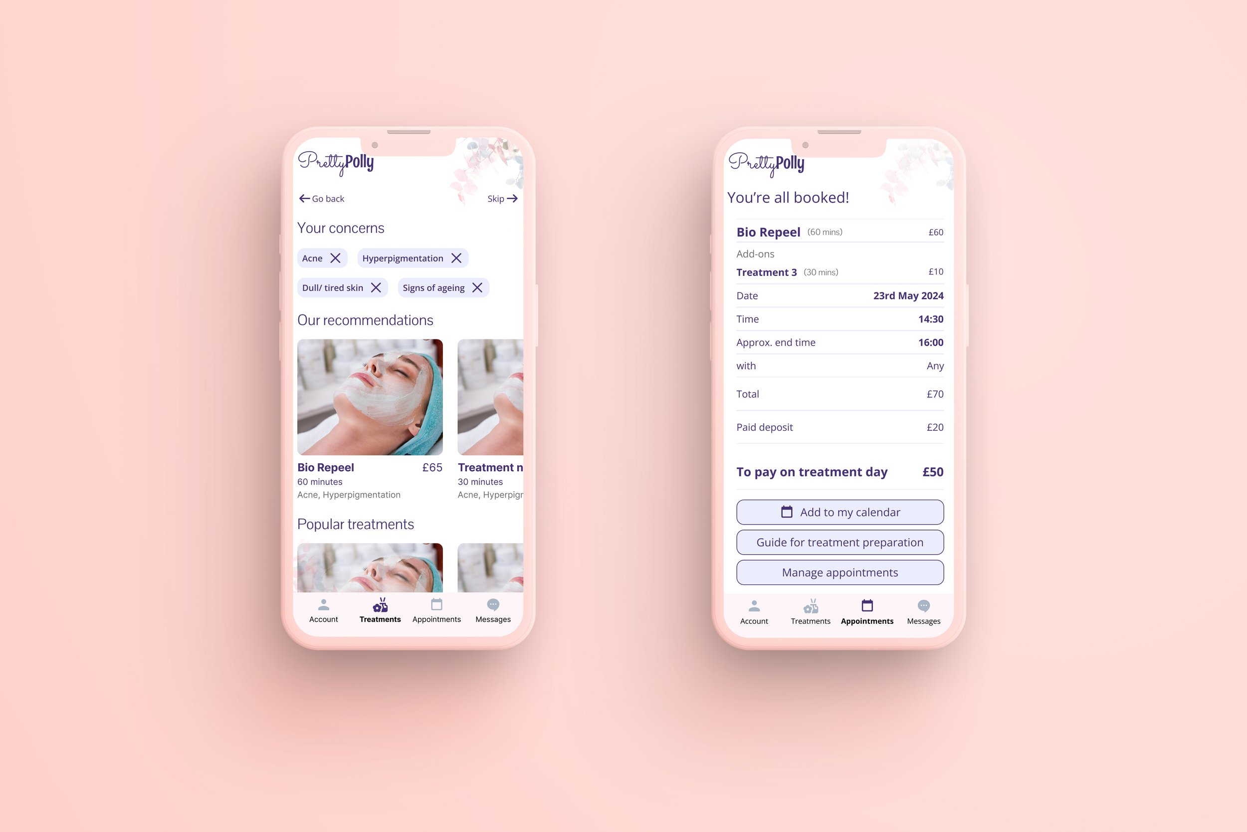
Helping first-time clinic visitors feel more confident about where to start
Overview
Pretty Polly wanted a concept app to help customers learn about treatments and book appointments alongside its existing website.
I started with a different question: why would an existing customer need an app at all?
A conversation with the clinic owner revealed that most treatments require three or more sessions to show results. The opportunity wasn't simply to facilitate a booking. It was to help first-time visitors become confident enough to start a relationship with the clinic.
That shaped the product around three core journeys:
Sign up → Find the right treatment → Book
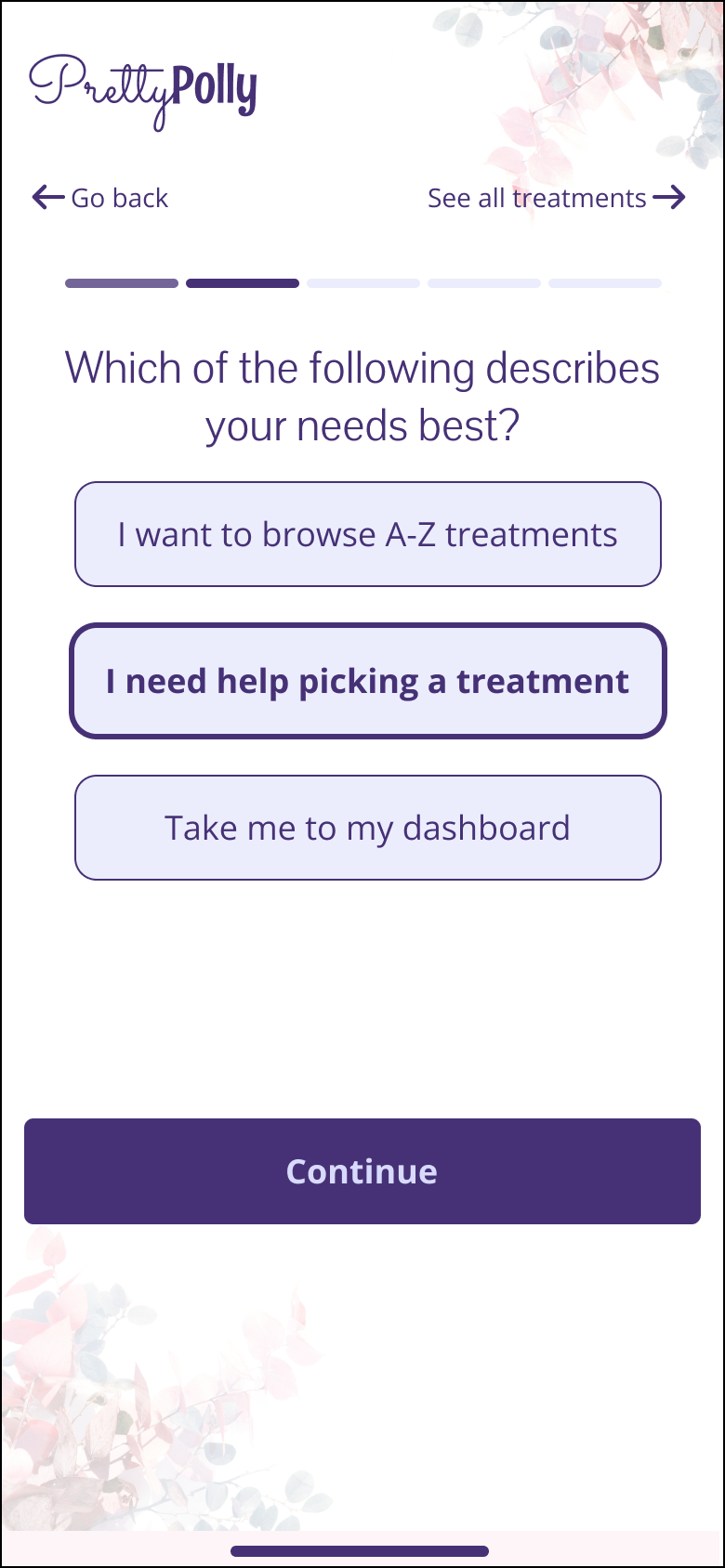
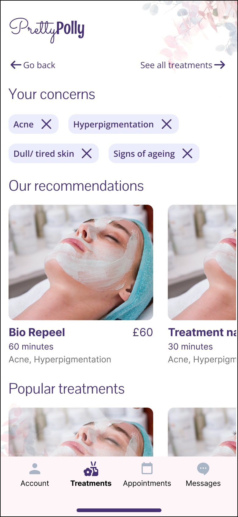
The most important of these became a treatment-matching journey for people who knew they wanted help but didn't know what treatment they needed.
The problem
The problem wasn't just booking
Competitor research showed that many beauty and aesthetics apps behaved more like aggregators, making it difficult for Pretty Polly to differentiate through the app experience itself.
Input from the clinic and existing customer context pointed to a more fundamental problem: new customers may not know the language of treatments well enough to choose one confidently.
That shifted the brief from:
“How do we help someone book a treatment?”
to:
“How do we help someone understand where to start?”
That became the reason for prioritising treatment matching rather than building a straightforward treatment catalogue and booking flow.
Making the MVP smaller
The original concept included a broader set of features, including loyalty and more personalised content.
With only two weeks available, I advocated for an MVP focused on the three journeys most important to a first-time visitor:
Sign up and onboarding
Treatment matching
Booking
Loyalty and additional content were deliberately pushed into later phases.
This made the concept testable within the timeframe and concentrated the design effort on the part of the experience where the biggest uncertainty existed: helping someone decide what they actually needed.
Designing for reassurance
The tone of the experience became an important design constraint.
Treatment descriptions and clinic terminology can feel clinical or difficult to navigate when you're unfamiliar with them, so I explored a more conversational approach across the key journeys.
I developed the flows from sketches into mid and high-fidelity prototypes, focusing on:
Making the treatment-matching questions easy to understand
Explaining treatments without overwhelming first-time visitors
Keeping the journey conversational rather than clinical
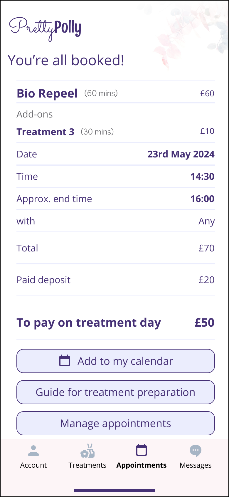
Moving naturally from uncertainty → recommendation → booking
The prototype covered sign-up and onboarding, treatment matching and appointment booking.
Testing
Testing revealed a bigger opportunity
High-fidelity usability testing was positive overall. Participants described the experience as inviting and straightforward, and the treatment-matching journey was particularly reassuring.
Then two participants independently made a connection I hadn't designed for.
They told me they had previously avoided walking into skin clinics because the experience felt intimidating.
That changed how I understood the value of the matching journey.
It wasn't only helping people who didn't know which treatment to choose.
It was also giving first-time visitors a less intimidating way into the clinic, allowing them to explore what might be appropriate before having to walk through the door.
That insight wasn't something Pretty Polly had asked me to solve. It emerged because the concept was tested with real people rather than validated only through stakeholder feedback.
What testing revealed
Testing also exposed areas that needed further iteration:
The treatment details page was still difficult for some participants to follow.
Users wanted an easier way to return to treatment matching rather than treating it as a one-time journey.
Checkout and pre-payment needed further exploration.
Loyalty remained outside the MVP and would require a later phase.
These became the next product questions rather than problems I tried to solve within the original two-week scope.
Reflection
The most useful finding wasn't the one I went looking for.
I designed treatment matching to reduce decision uncertainty. Testing showed it could also reduce emotional uncertainty, giving someone who found clinics intimidating a more comfortable first step.
That reinforced the value of testing early concepts with real people. A feature can solve a problem you can articulate while also revealing a problem you hadn't considered.
The project also pushed my UI practice because I wasn't working from an existing design system. Every pattern had to earn its place through the needs of the experience and the clinic's brand, rather than being inherited from an established component library.
The biggest takeaway: sometimes the value of a product feature isn't just what it helps someone decide. It's whether it makes taking the first step feel possible.